Marketing as craft
When I first started at Intuit I worked as an interaction designer on the QuickBooks Marketing Experience Design team, whose responsibilities included quickbooks.com. When I moved to the Design Tech team, I had many opportunities to work with my former teammates on novel marketing experiences.
Initially, I was skeptical about the user benefits that I could deliver working on marketing, but there are a few things that I've found can make marketing projects uniquely impactful:
- new users: you're making the first impression
- bold experimentation: more organizational willingness to try new things
- learning mindset: even if a test doesn't deliver the desired results, we collect learnings we can apply in the future
- empowered designers: a single designer occasionally has the chance to re-envision large portions of the experience, and partnering with that designer to bring their vision to life is extremely gratifying
- scrappy: occasionally my "prototype" would ultimately be shipped in production
Passion Project Microsite #
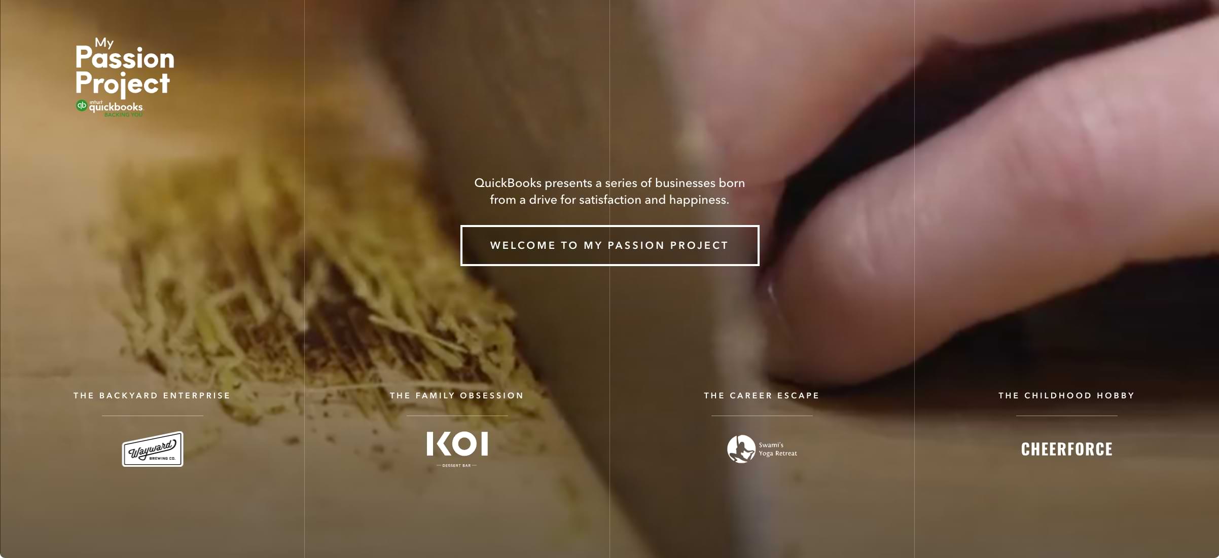
This microsite for the QuickBooks Australia team was my first experience using Gatsby and the project was a blast because the designer (Aman Braich) had a clear vision that diverged significantly from the usual QuickBooks brand identity. With an introductory animation, fullscreen video, and velvety smooth animations, we were both really happy to get this shipped.
The core idea of the site was to showcase some passionate small business owners and highlight how QuickBooks enabled them to focus more on their passion and less on their bookkeeping.
My Passion Project site (our testing URL, this campaign is no longer live)
QuickBooks Capital #
This was a completely new offering and I had the opportunity to build the first marketing site for it. Since this original page was built, QuickBooks Capital has facilitated over $1B in loans to small businesses.
Here's a short video walkthrough. (1:20)
Experimental Scroll Animations #
Backflip #
For Project Backflip, animation progression was directly tied to your scroll position on the page. This was a fun challenge because I needed to build the animations in After Effects then coordinate their progression in JavaScript with the rest of the content. Fortunately, this experiment shipped on desktop only, so there was just a single breakpoint to consider. The effect was great as long as the user scrolled at fairly deliberate pace, but got a bit intense when they scrolled more quickly. The idea of illustrating the product story (and how different facets of the experience fit together) is compelling though.
Rocketman #
For Project Rocketman (try the last link on that page) all of the animations were built in CSS and triggered by your scroll position instead of being directly tied to it. This was an improvement from Backflip since animation durations don't change with scroll speed. On a later version that I edited directly on the CMS (and thus no longer have a copy of) I added a texture behind the device that always scrolled at the default natural scroll speed. This provided consistent visual feedback that scrolling was still working as expected within each sticky section.
Reflections #
Both of these experiments shipped to customers, but we always trended back towards more traditional layouts since they're much easier to build and update.
Without some visual element scrolling at the natural scroll speed they can feel like scrolljacking, even if we haven't modified the default browser scroll behavior. These are admittedly a bit over the top and raise some accessibility concerns. Scrolling may not be the right interaction for these experiences, but the choreography between visual storytelling and other page content definitely has value.